


Fragments United — from the archive of interfaces worth remembering
Step inside. Mind the velvet rope.
Every museum has a permanent collection — the pieces that survive changing directors, shifting tastes, and the occasional fire. In the museum of UX, that collection is small. Trends rotate through the temporary galleries: skeuomorphism had its wing, then flat design, then glassmorphism, each eventually wheeled down to storage. But in the central hall, under steady light, hang ten heuristics that Jakob Nielsen catalogued in 1994 — and that no curator since has dared to deaccession.
They endure because they were never about pixels. They were about people. Let us walk the hall.
Exhibit I: Visibility of System Status
The oldest artifact in the collection, and arguably the most copied. An interface should always tell you what it is doing — loading, saving, thinking, failing. The progress bar is its most famous reproduction, but you will find this heuristic in every era: the whir of a floppy drive, the spinning beach ball, the three dots that mean someone is typing. Silence, in interfaces as in museums, makes visitors nervous.
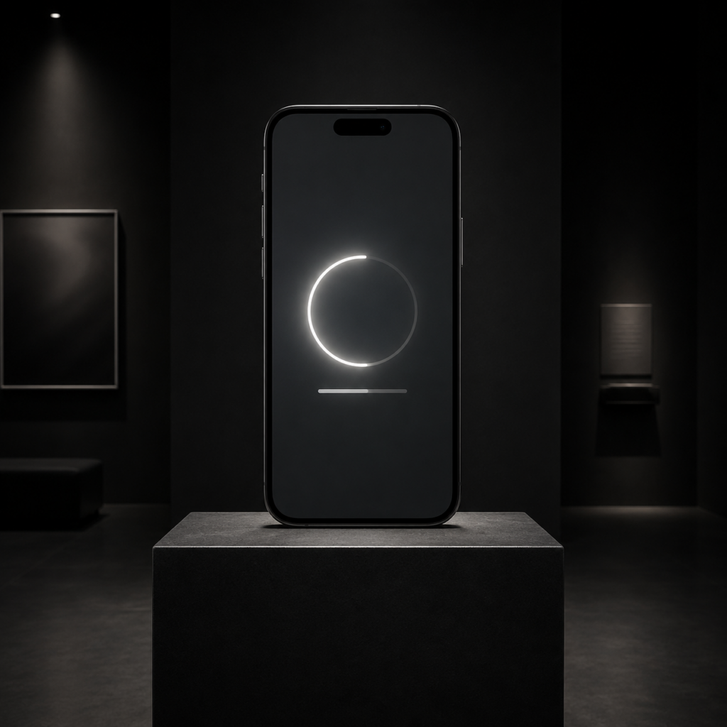
Exhibit II: Match Between System and the Real World
A trompe-l’oeil piece. The interface should speak the visitor’s language, not the institution’s. When a banking app says “insufficient funds” instead of “ERR_4031: transaction constraint violation,” it is honoring this heuristic. The desktop metaphor — folders, trash cans, documents — is this exhibit’s grandest installation, so successful that most visitors forget it is a metaphor at all.
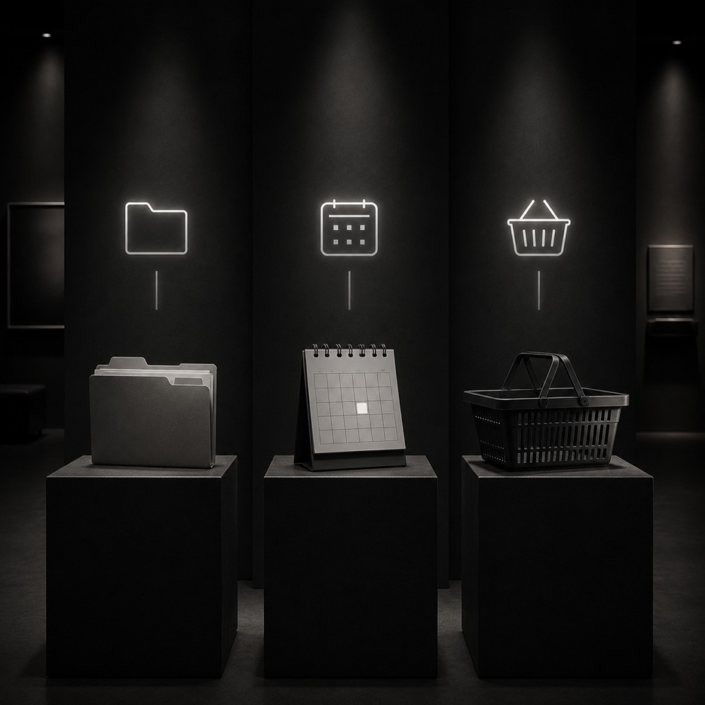
Exhibit III: User Control and Freedom
Sometimes called the emergency exit, and every gallery needs one. Undo. Cancel. Back. Visitors wander into places they did not intend, and a humane interface lets them leave without filling out paperwork. Note the small plaque beneath this piece: it was funded by everyone who has ever accidentally deleted something.
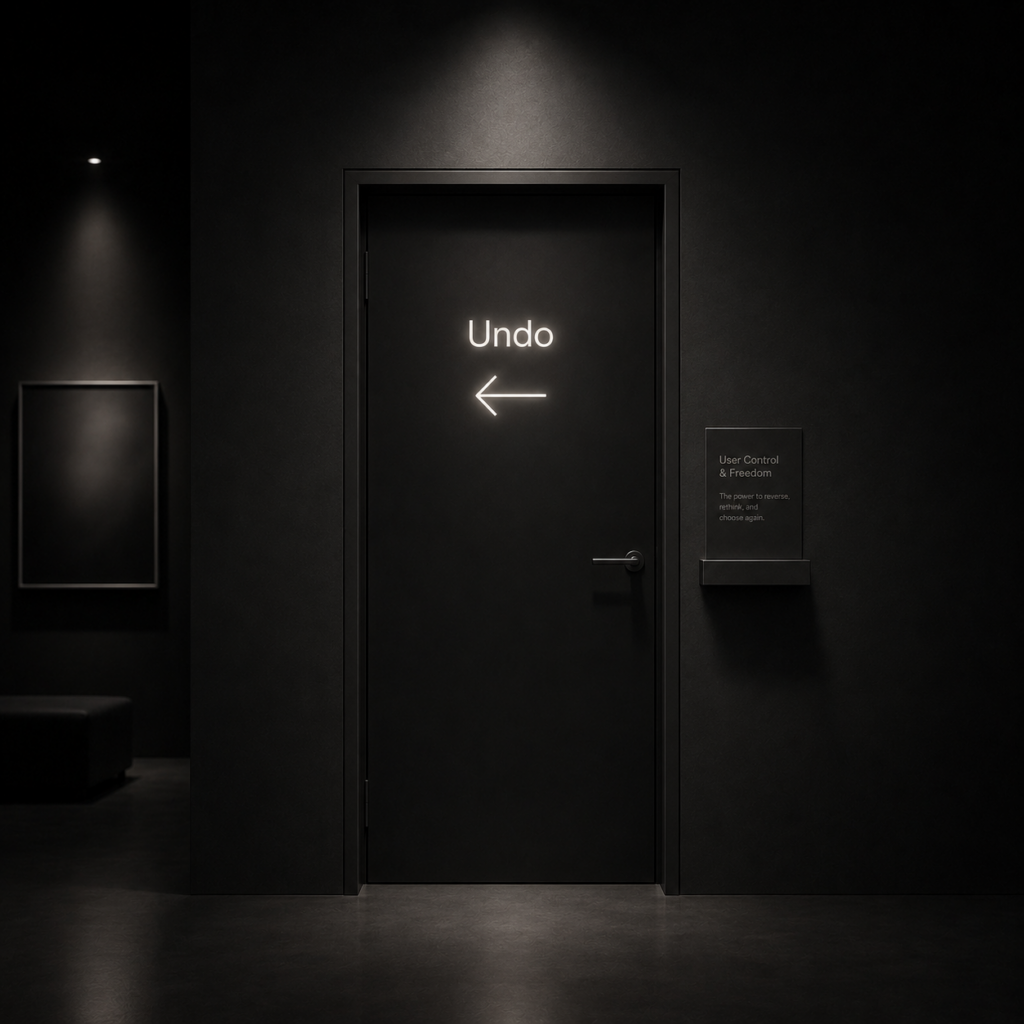
Exhibit IV: Consistency and Standards
The least glamorous work in the hall, and the load-bearing one. A word should mean the same thing on every screen. A button should live where buttons live. This heuristic asks designers to suppress their most dangerous instinct — the urge to be original where originality costs the visitor comprehension. Save your invention for the art. The signage should be boring.
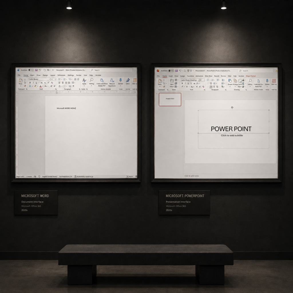
Exhibit V: Error Prevention
On display are two quiet acts of foresight: a clearly emphasized primary action, and a form that gives guidance before something goes wrong. Error prevention is not about rescuing users after failure — it is about designing the path so failure is less likely in the first place. A stronger visual hierarchy helps users choose the right action. Real-time validation helps them correct issues before submitting a form. The best interfaces do not wait for mistakes and then apologize; they anticipate confusion, reduce risk, and gently guide users toward success.
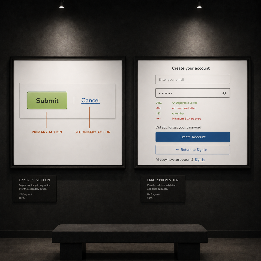
Exhibit VI: Recognition Rather Than Recall
Museums understood this before software did: you put the label next to the painting. Do not ask visitors to memorize; show them their options and let them recognize the right one. Menus over command lines. Recently opened files. Autocomplete. Human memory is a leaky vessel, and good design stops asking it to carry water.
Exhibit VII: Flexibility and Efficiency of Use
Exhibit VIII: Aesthetic and Minimalist Design
Often misread as an argument for whitespace worship. Look closer. The heuristic says only this: every element on the screen competes with every other element for attention. Each irrelevant unit of information diminishes the relevant ones. A curator does not hang forty paintings on one wall — not because forty paintings are ugly, but because the visitor can only truly see a few.
Exhibit IX: Help Users Recognize, Diagnose, and Recover from Errors
Not every missing piece belongs in storage. Sometimes the visitor arrives, only to find the fragment is gone — moved, misplaced, or no longer on display. In those moments, the interface should not speak in riddles. It should say clearly what happened, reassure the user, and point to the next step. “This fragment is lost. It may have moved to another room. Go back to homepage” does exactly that: plain language, context, and a path forward. Good error handling does not dramatize the mistake. It simply helps people recover with dignity.
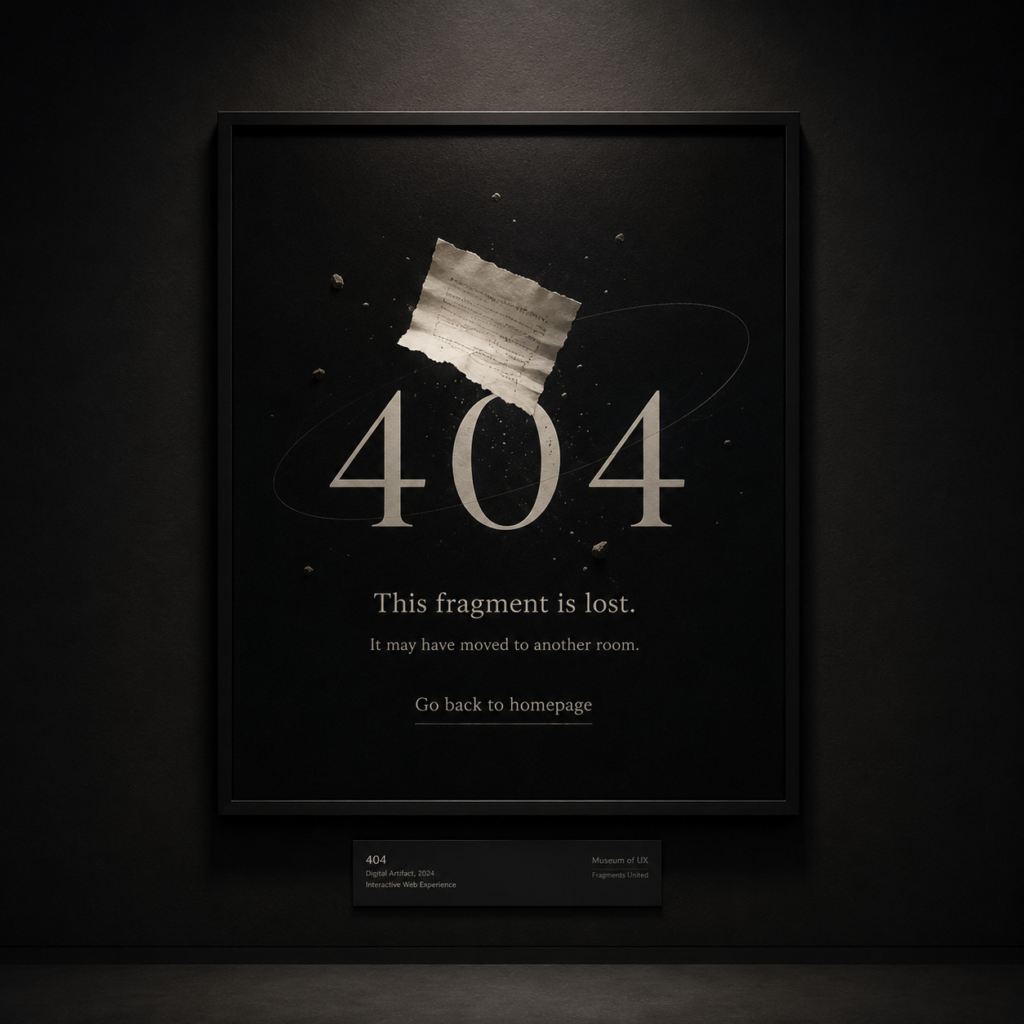
Exhibit X: Help and Documentation
The final room, near the exit, as help sections tend to be. The best interface needs no manual — but the best museum still has a front desk. When documentation is necessary, it should be easy to search, focused on the visitor’s task, and mercifully short. Nobody comes to the museum to read the catalog. They come to see the work.
Before You Exit Through the Gift Shop
Heuristics are not laws. They are the accumulated judgment of everyone who watched a user struggle and wrote down why. That is what makes them worth curating: they are fragments of failure, restored and reassembled into something you can learn from — which, if you have read the name above our door, is rather the point of this whole institution.
Use them as an inspection checklist, not a design recipe. Walk your own interface the way a conservator walks a gallery: slowly, with a flashlight, looking for the cracks. The ten exhibits above will tell you where to point the beam.
The museum is open. Admission, as always, is attention.