


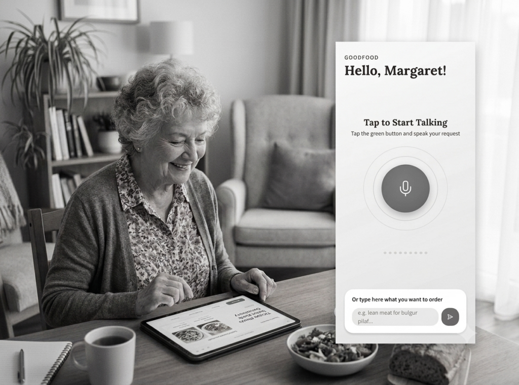
In my previous post, I introduced Margaret— a senior persona for a food delivery app — and a voice-first prototype built around her needs. While designing it, I ran into a genuine design dilemma, the kind that opinions cannot settle. Only testing can. So in this case study, I want to show you exactly how I would run that test, step by step, using a Figma prototype and UXtweak — including the parts most tutorials skip: the hypothesis, the metrics, and the honest limitations.
First, a confession about the term “A/B testing”
Let’s be precise, because precision here is what separates research from guessing. Classic A/B testing means splitting live traffic on a shipped product between two versions and measuring which performs better — it needs a working product and large numbers to reach statistical significance. What I’m describing here is an A/B-style comparative usability test on a prototype: two design variants, a small number of real participants, and a mix of behavioral and attitudinal data. It won’t give you statistical proof. It will give you something arguably more useful at this stage: a clear directional answer plus the reasons behind it, before a single line of code is written.
The design dilemma: two ways to talk to an app
The prototype’s core interaction is voice. But how should Margaret start talking?
Variant A
Press & Hold While Talking
A walkie-talkie interaction: hold the green button for the entire request, release to send. Clear start and stop, no accidental listening.
The concern. Sustained pressure while speaking a full sentence is motorically demanding for hands with tremor or arthritis — precisely the traits of this persona.
Variant B
Tap to Start Talking
Tap once to start, speak freely, recording stops on silence (or a second tap). The confirmation screen shows the transcript with a “Tap to edit” option.
The concern. Less explicit control over when the microphone is listening — potentially a trust issue for a privacy-cautious persona.
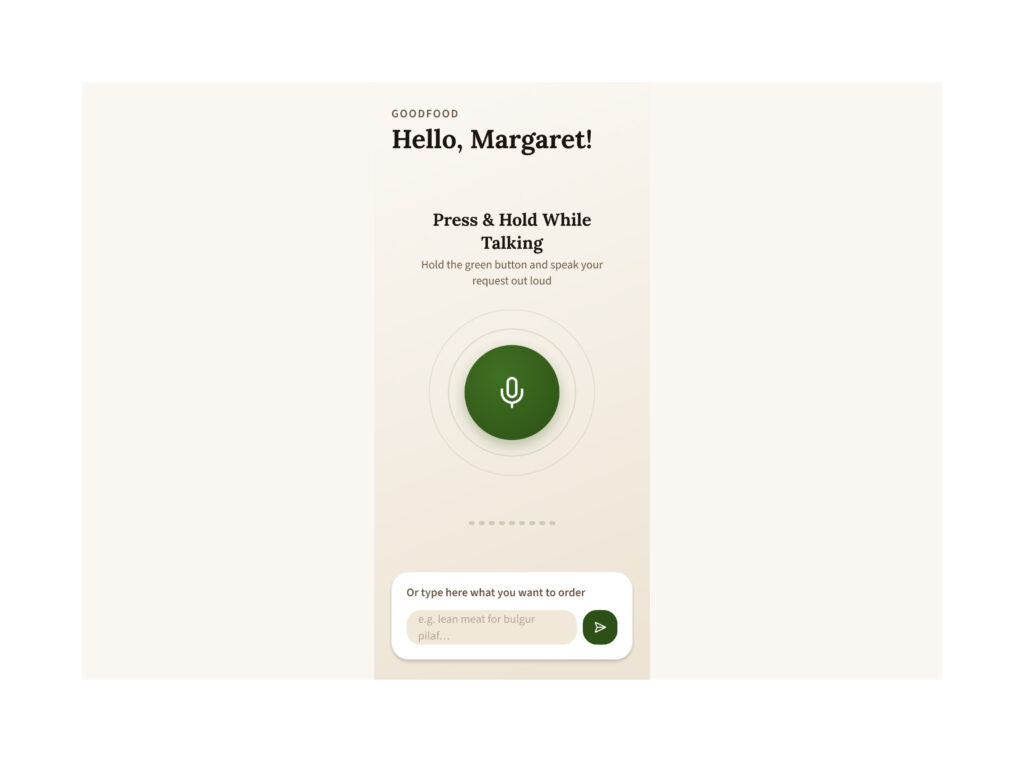
Variant A home screen — “Press & Hold While Talking”
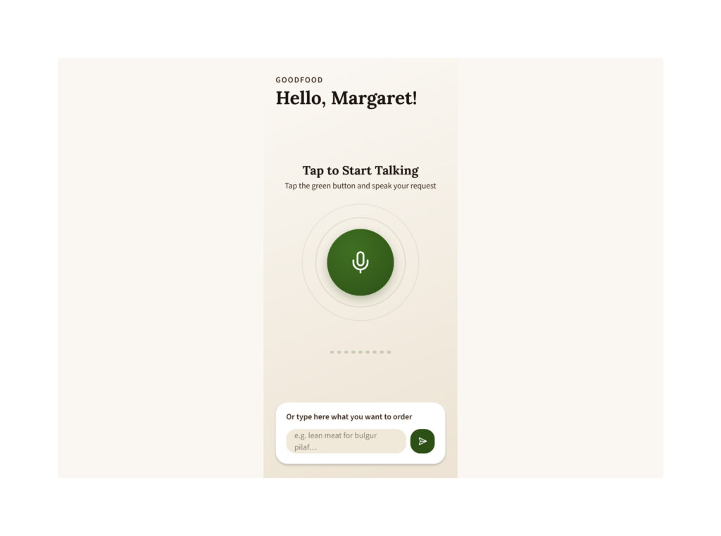
Variant B home screen — “Tap to Start Talking” + confirmation screen with “Tap to edit”
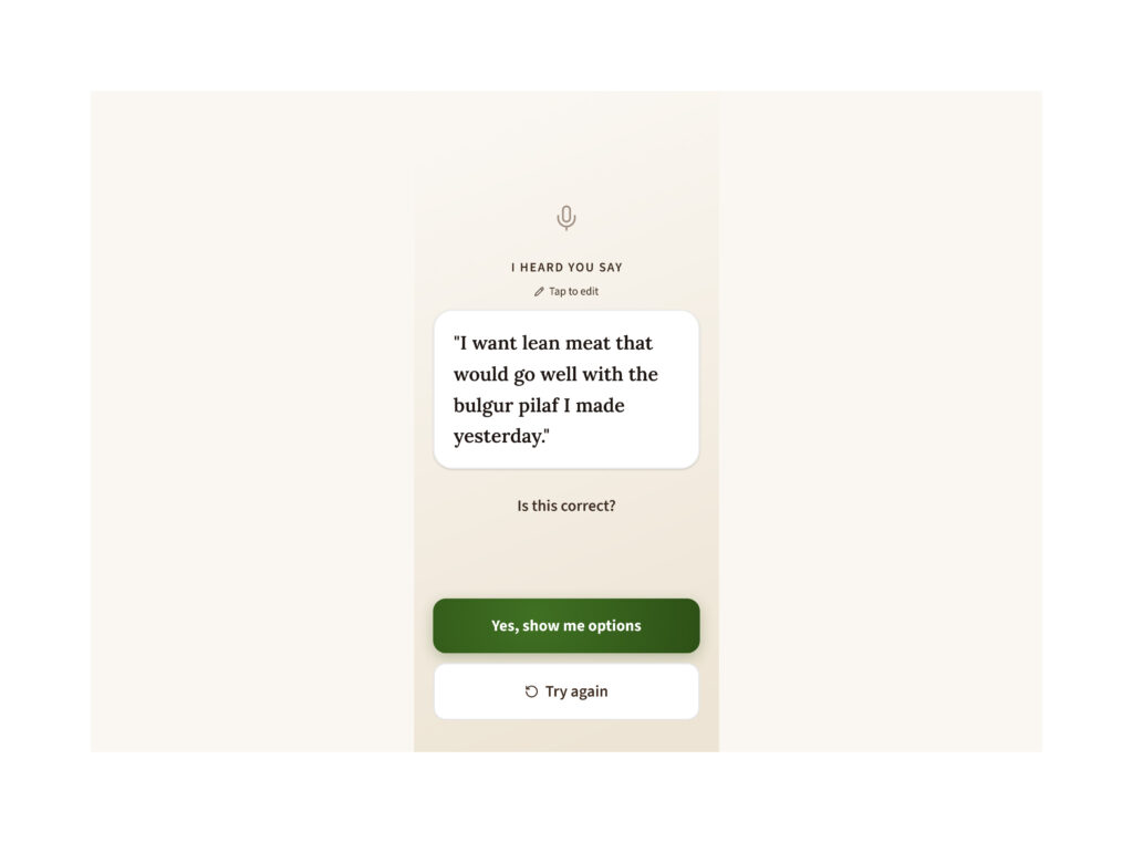
Confirmation screen with “Tap to edit”
Notice that both variants are defensible. That is exactly when you test: not to confirm what you already believe, but because two reasonable design arguments point in opposite directions.
Step 1 — Write a falsifiable hypothesis
A test without a hypothesis is a fishing trip. Mine would be:
Senior participants (65+) will complete a voice food order faster, with fewer abandoned attempts, using tap-to-start (Variant B) than press-and-hold (Variant A) — and will rate Variant B as less physically demanding. However, Variant A may score higher on perceived control over the microphone.
Every part of this can be proven wrong by the data. That second sentence matters: I’m writing down what the losing variant might still win at, so I can’t quietly move the goalposts after seeing results.
Step 2 — Choose the study design: between-subjects
Each participant tests only one variant. Why not let everyone try both and compare? Because of learning effects: whoever completes the order once will be faster and more confident the second time, regardless of the design — and with senior participants, fatigue in longer sessions would skew results further. Between-subjects costs more participants but keeps the comparison clean. With two groups of five to eight seniors each, you won’t get statistical significance — you will get converging evidence and, through recordings, the why behind every number.
Step 3 — Set it up in UXtweak
The workflow is refreshingly simple: import the Figma prototype via its share link, create the study, add tasks and questions, preview, launch. I would create two separate Prototype Testing studies — one per variant — and assign each participant to exactly one. The tasks, questions, and welcome text stay identical in both; the only thing that differs is the prototype. That’s the discipline of A/B thinking: change one variable, hold everything else constant.
The task script I would use, in order:
- Task 1 — the core order. “You want to order lean meat that goes well with the bulgur pilaf you made yesterday. Use the app to place this request.” (This is the scripted happy path both prototypes are built around.)
- Task 2 — the correction. “The app misunderstood one word of your request. Fix it.” (In Variant A this forces a full re-record via Try again; in Variant B it can be done via Tap to edit. This task is where I expect the variants to diverge most.)
- Task 3 — the fallback. “Imagine you are in a noisy room and cannot use your voice. Place the same order another way.” (Tests discoverability of the typed input.)
After the tasks, three short questions on a 5-point scale: How physically tiring was using the microphone button? How confident were you that the app heard exactly what you said? How in control of the microphone did you feel? — plus one open question: What would have made this easier?
Step 4 — Decide the metrics before you look at the data
| What I measure | How | What it tells me |
|---|---|---|
| Task success rate | UXtweak task statistics | Can Margaret order food at all? |
| Time on task | UXtweak task statistics | Which interaction is more efficient |
| Paths & misclicks | Heatmaps and funnels | Where each design confuses people |
| Perceived effort, confidence, control | Post-task rating questions | The persona’s subjective experience |
| The “why” behind everything | Screen + audio recordings, think-aloud | Reasons, hesitations, workarounds |
Deciding metrics in advance is the quiet hero of good research. If you choose them after seeing the data, you will always find a number that flatters your favorite design.
Step 5 — Recruit real seniors (yes, this is the hard part)
As I said in the previous post: you don’t test the senior persona’s prototype with your best friend — you test it with your grandmother. In practice that means recruiting participants aged 65+, screening for the persona’s traits (orders food at least occasionally, uses a smartphone with some difficulty), and accepting that this audience is harder to reach remotely. UXtweak offers a global user panel and lets you bring your own participants via a study link; for seniors I would lean on my own recruiting — local community, family networks, a retirement community if possible.
And I would run this as a hybrid: a few moderated sessions (in person or via live interview, where I can help with setup and probe with follow-up questions) plus unmoderated sessions for volume. Seniors often find remote unmoderated testing intimidating — the think-aloud protocol alone needs a warm-up. A methodology that ignores this reality produces beautiful dashboards and misleading data.
Step 6 — The honest limitations
Every case study should have this section, and most don’t. Mine: (1) The voice interaction in a Figma prototype is simulated — the transcript is scripted, so I’m testing the interaction model, not real speech recognition accuracy. A senior mumbling into a real ASR engine in Serbian is a separate, later test. (2) Small samples give direction, not proof — I report findings as “4 of 6 participants,” never as percentages. (3) Prototype testing rewards the happy path; real orders involve menus, prices, and payment anxiety that this study deliberately postpones. Knowing what your test doesn’t tell you is part of the result.
What I expect — and what would change my mind
My prediction is that Variant B wins on effort and completion, and that Task 2 (the correction) is where Variant A visibly frustrates people — a full re-record is a heavy price for one misheard word. But I can describe exactly what would change my mind: if participants in Variant B hesitate before tapping because they’re unsure whether the microphone is still listening, or report feeling less in control, then the trust cost outweighs the motor benefit — and the design answer becomes a third variant: tap-to-start with a much louder visual “listening / stopped” state.
That is the real lesson of A/B thinking on prototypes. The goal is not to crown a winner. It is to replace a debate between two reasonable opinions with evidence — and to already know what you’ll build next, whichever way the evidence points.
Try it yourself
Senior Food Ordering App — Live Prototype
The voice-first, large-type prototype this case study is built around.
Read the first part of this series: Rise Above the Generic: Designing for Real Users — where Margaret’s persona, the design decisions, and the video that started it all live.
Build products people actually love to use.